
Choosing the right grout color really comes down to one big question: do you want it to blend in, or do you want it to stand out?
It’s that simple. You can either match the grout to your tile for a seamless, unified look or go for a contrast to create a bold, graphic pattern that frames every single tile.
Why Your Grout Color Choice Matters So Much
Let's be honest, picking a grout color is probably the last thing on your mind during a big tile project. But it's one of the most underrated decisions you'll make, and it has a massive impact on the final look. Grout isn't just the stuff that fills the gaps; it's a design tool that can completely define your space.
The right shade can elevate a simple, affordable tile into a sophisticated, high-end feature. The wrong one? It can make your entire project feel a bit… off. It’s the finishing touch that pulls the whole room together.
Think about it this way: the grout color determines if your room feels open and calm or busy and detailed. For homeowners here in Southwest Michigan, a thoughtful choice means creating a space that looks great and stands up to real life, whether it’s a high-traffic kitchen in Portage or a peaceful bathroom retreat in Kalamazoo.
Setting the Foundation for Your Design
Before you even look at a color chart, it helps to understand the "why" behind your choice. This isn't just about picking a color you like; it’s about understanding the relationship between the grout and the tile.
Here’s what I always tell my clients to think about first:
- Creating Harmony: If you match your grout to the main color in your tile, you get this smooth, continuous surface. This little trick can make a smaller room feel much bigger and really lets the tile's unique texture or finish shine.
- Making a Statement: On the other hand, a contrasting color—like a dark charcoal grout with a classic white subway tile—makes the pattern the star of the show. This is perfect if you're using an interesting shape, like a hexagon, or laying your tiles in a cool design like a herringbone.
- Considering the Tile Itself: The tile you've picked also plays a huge part. Big tiles, small tiles, tiles with wavy, rustic edges, or tiles with sharp, rectified edges all interact with grout differently. Those super-sharp rectified tiles allow for razor-thin grout lines (1/16"), which makes any color choice a bit more subtle.
My best advice? Stop thinking of grout as a boring necessity and start seeing it as a design element. It’s the key to getting a professional, polished look you’ll love for years. This guide will walk you through the practical steps to pick the perfect grout with total confidence.
The 3 Essential Grout Color Strategies: What’s Your Goal?
When it comes to choosing grout color, you really only have three directions you can go. Each path creates a completely different mood, so the first step is figuring out what you want your tile to do for the room. Are you aiming for a seamless, unified surface, or do you want to make a bold, graphic statement?
This simple flowchart can help you decide which strategy best fits your vision.

Ultimately, you’re either trying to blend everything together for a quiet, cohesive look or frame each tile to highlight its unique shape and pattern. Let's dig into how each strategy achieves this.
Strategy 1: Matching Grout for a Seamless, Unified Look
If you want your beautiful tile to be the undisputed star of the show, a matching grout color is your best bet. This technique creates a cohesive, almost monolithic surface where the grout lines seem to vanish.
The end result is a subtle, serene aesthetic that can make a small room feel much larger and more open. It’s the perfect choice when you've invested in a gorgeous natural stone with tons of character or a tile with a unique texture you don't want to break up.
By blending the grout with the tile, you're guiding the eye to see the entire surface as one continuous element. This is an incredibly effective technique for creating a calm, spa-like atmosphere in a bathroom or a clean, expansive feel in a kitchen.
Strategy 2: Contrasting Grout to Make a Bold Statement
Ready to make a bigger impact? This is where contrasting grout comes into play. It’s about intentionally choosing a color that pops against your tile—think classic black grout with white subway tiles or a crisp white grout against deep blue ceramic.
This choice transforms your grout lines from a simple necessity into a core design feature. It accentuates the shape of each tile and creates a graphic, eye-catching pattern. Imagine how a deep gray grout can define a stunning herringbone pattern on a bathroom floor, turning an ordinary surface into a true work of art.
We're seeing grout treated as a design element more and more. Bold choices like black or navy now account for 22% of high-end custom installations, a huge jump from just a few years ago. Homeowners and designers are realizing the power of contrast to create a truly custom look—a sentiment we often see in Southwest Michigan projects, where black grout on white hex tiles makes a huge statement.
Globally, reports show that 40% of interior designers now treat grout as a key design feature. You can find more insights into the growing global tile grout market at researchandmarkets.com.
Strategy 3: Neutral Grout as the Versatile Middle Ground
If matching feels a bit too safe but a high-contrast look seems too bold for your taste, the neutral strategy is the perfect compromise. This approach involves picking a grout color that’s just a few shades lighter or darker than your tile—think light grays, soft beiges, or muted taupes.
A neutral grout subtly defines the tile pattern without screaming for attention. It provides just enough definition to highlight the layout and shape of the tile without overwhelming it.
This is often the most practical and timeless choice for a few key reasons:
- It’s incredibly forgiving. A light gray or beige is much better at hiding everyday dirt and minor stains than a stark white.
- It’s flexible. Neutrals work beautifully with almost any tile color and style, from traditional farmhouse to sleek contemporary.
- It has wide appeal. If you’re thinking about future resale value, a tasteful neutral grout is always a safe and stylish bet.
Grout Color Strategy Comparison
Here’s a quick-reference table to help you compare these three strategies at a glance. It breaks down the visual impact, best-use cases, and maintenance considerations for each approach.
| Strategy | Visual Effect | Best For | Maintenance Level |
|---|---|---|---|
| Matching | Creates a seamless, unified look; makes spaces feel larger. | Highlighting the tile itself (e.g., natural stone, textured tiles). | Low to Medium: Hides imperfections but light colors can still stain. |
| Contrasting | Accentuates tile shape and pattern; creates a bold, graphic look. | Simple tile shapes like subway, hex, or square to create a grid or pattern. | High: Every imperfection, stain, or bit of grime on light grout is visible. |
| Neutral | Subtly defines tile shape without overwhelming the design. | Almost any tile; a safe, timeless, and practical choice. | Low: Light grays and beiges are excellent at camouflaging dirt. |
Choosing the right strategy comes down to personal preference and the specific goals you have for your space. Each one offers a distinct look, so think about the final feeling you want to achieve.
Getting Down to the Nitty-Gritty
Okay, so we’ve talked about the big ideas of matching versus contrasting. But now it’s time to get practical. The little details are what truly make or break a tile project, and thinking them through now will save you from that sinking feeling of "I wish I'd chosen differently" down the road.
First things first, take a long, hard look at your tile. I mean really look at it. Is it a simple, solid color? Or is it busy, with lots of color variation and movement?
If you're working with a multi-tonal tile, like a slate or a porcelain that mimics veiny marble, your best bet is usually a neutral grout. Pull one of the subtle mid-tones from the tile itself. This approach lets the tile be the star of the show without creating visual chaos. A bold, contrasting grout here would just fight for attention, making the whole surface look messy.
How the Room Itself Changes Everything
You'd be amazed at how a grout color that looks perfect in the store can suddenly look completely wrong once it's in your home. The room's lighting and overall environment are huge factors.
Think about the space. Is it small and dark, or big and bright?
-
Small or Dimly Lit Rooms: In a tiny powder room, a basement, or any space without much natural light, dark grout can feel oppressive. It sucks the light right out of the room, making it feel smaller. Lighter grout is your friend here—it reflects light and creates an illusion of spaciousness.
-
Large, Bright Rooms: Got a big, sunny kitchen? You've got more options. A dramatic, dark grout won’t overwhelm a large space. In fact, it can anchor the design and give your floor or walls some serious definition and character.
Here’s a pro tip that catches so many people off guard: Grout always dries lighter than it looks when it's wet. We're talking up to two full shades lighter. When you're looking at those wet samples, you have to mentally lighten them to picture the final result.
Let's Talk Grout Lines and Grime
Now for the most unglamorous but essential part: cleaning. How you live and where the tile is going should be a major voice in your grout color decision.
That brilliant white grout might look stunning in a rarely used guest bathroom, but it's a recipe for disaster on a kitchen backsplash behind the stove. It’s practically a magnet for spaghetti sauce stains. For high-traffic areas like mudrooms and kitchens, medium grays and beiges are the unsung heroes. They do an incredible job of hiding the daily dirt and grime.
Finally, don't forget about the width of your grout lines. This is more important than you think.
-
Thin Grout Lines (1/16" to 1/8"): Often used with precisely cut rectified tiles, thin lines make the grout color much less noticeable. This gives you the freedom to be a bit more adventurous with your color choice since it won't dominate the look.
-
Wider Grout Lines (3/16" and up): With wider lines, the grout becomes a major design element. Its color will have a much bigger impact on the final aesthetic, so sticking with a neutral or matching shade is often the safer, more timeless option.
Of course, the tile material itself plays a big role. For example, the beautiful, inherent variations in natural stone floor tiles often look best with a grout that complements, rather than competes with, their organic patterns. Juggling all these factors is the key to choosing a grout that’s not just beautiful, but also perfectly suited to your home and lifestyle.
Your Go-To Grout Colors and How to Use Them
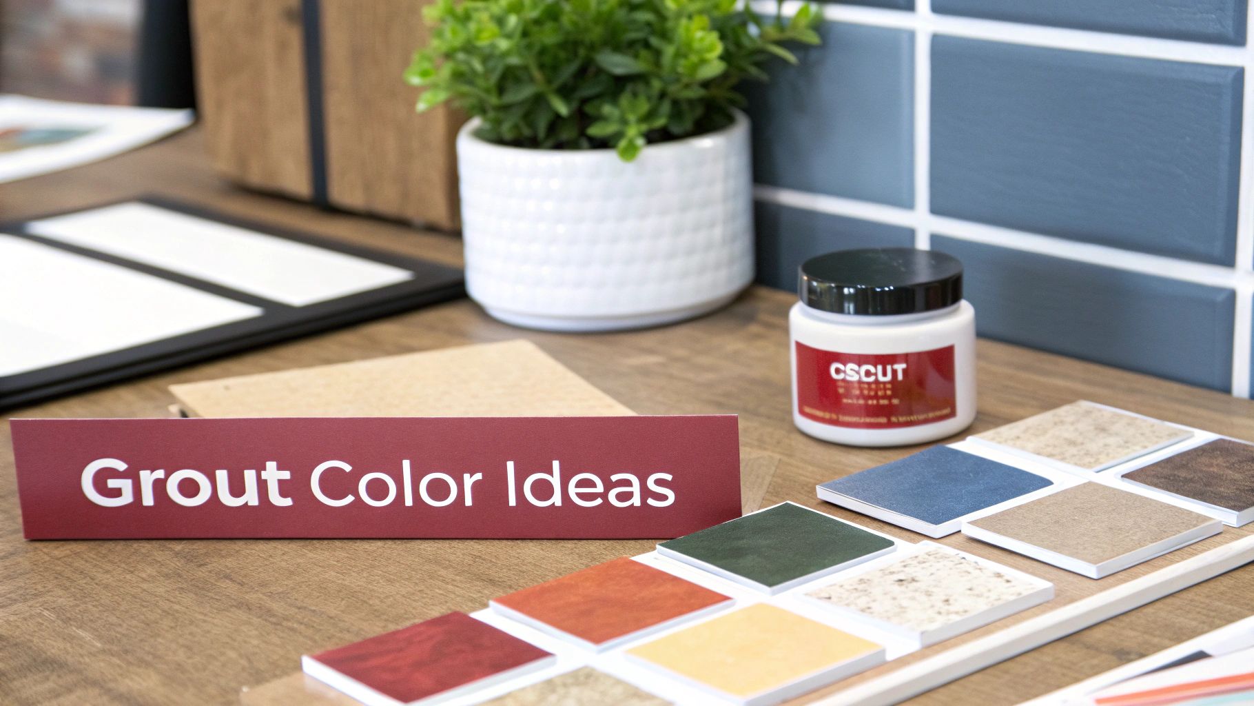
Knowing the theory is great, but let's get down to brass tacks. Seeing real-world examples makes all the difference when you're staring at a wall of color chips. Let's walk through the most popular grout colors we see in homes right here in Southwest Michigan and talk about why they work so well.
Each of these shades brings its own personality to the table. Choosing the right one is your ticket to creating the exact vibe you're after, whether that's a calming bathroom retreat or a kitchen backsplash that pops.
The Undisputed Champion: Light Gray
There's a good reason light gray has become the default choice for so many designers and homeowners. It hits that perfect sweet spot—it defines your tiles just enough without being as stark as pure white or as heavy as a dark grout. Honestly, it’s the ultimate chameleon.
Its versatility is why it's a huge favorite, making up about 35% of selections in residential projects across North America. Light gray gives you a clean, contemporary look that’s also brilliant at hiding a little bit of daily grime. It's just so much more practical than pure white grout, which has dropped to a 15% market share mainly because it's so tough to keep clean. For more on these trends, you can check out this tile grout market report.
The Classic Choice: White and Off-White
For that timeless, squeaky-clean look, you really can't beat a classic white or a slightly softer off-white. This is your go-to for creating a spa-like bathroom or a bright, airy kitchen. When you pair it with light-colored tiles, it almost makes the grout lines disappear, creating a seamless, unified surface that makes a room feel bigger.
But let's be real for a second: white grout is a commitment. Even with today’s amazing sealers, it will demand more upkeep to stay looking pristine, especially in a high-traffic entryway or behind a splattery stove.
- Best Paired With: White subway tile for that iconic, monolithic look. It also looks fantastic with light blue or green tiles, giving off a fresh, coastal vibe.
- A Little Pro Advice: Consider an off-white or bone color. You still get that bright, clean aesthetic, but it’s a whole lot more forgiving than brilliant white.
The Bold Statement: Charcoal and Black
Ready to make a statement? Charcoal or black grout is how you do it. This isn’t just a filler; it’s a powerful design tool that puts a frame around every single tile, turning a simple pattern into a stunning architectural feature. It’s a knockout in modern, industrial, and even modern farmhouse spaces.
Just picture black grout with classic white subway or hexagon tiles—it’s a dynamic, graphic look that instantly adds a layer of sophistication. It forces the eye to notice the pattern and shape of the tile itself.
One thing to keep in mind: dark grout is a bit of a diva during installation. Any grout haze left behind on the tile will stick out like a sore thumb. Your installer needs to be meticulous with the cleanup, no exceptions.
The Earthy Tones: Warm Beige and Tan
When you want a space to feel warm and inviting, beige or tan is the way to go. These earthy tones are the perfect partner for natural stone tiles like travertine and slate, or even for those beautiful porcelain tiles that mimic wood or terracotta.
Instead of creating contrast, these warm neutrals blend right in, enhancing the natural, organic feeling of the tile. This is how you get that cohesive, welcoming atmosphere that’s perfect for a family kitchen, a cozy main bathroom, or a rustic mudroom. Using a grout from this color family really helps to ground the space and make it feel comfortable.
Don't Skip This: The Most Important Step of All
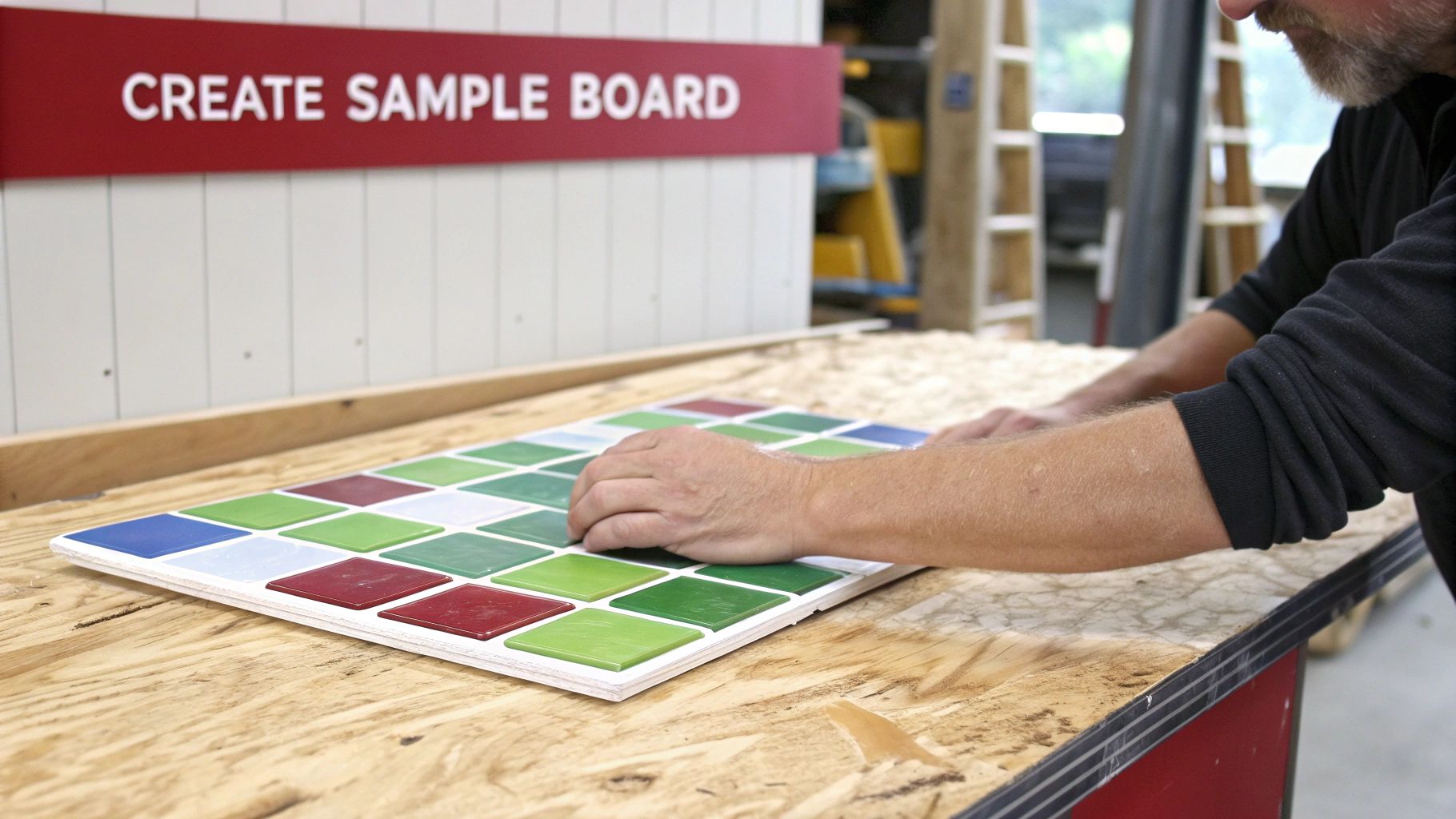
If you only take one piece of advice from this whole guide, make it this one. You absolutely must test your grout color in your own home, with your actual tile, before you commit. This is the single most important step in the entire process, yet it’s the one people are most tempted to skip just to save a little time.
Please, never, ever pick your grout based on those little plastic sample sticks from the hardware store or a color you see online. I guarantee that what you see under the harsh fluorescent lights of a showroom will look worlds apart from how it appears in the warm, natural light of your own kitchen.
Why Testing on-site Is Non-Negotiable
Color is a funny thing; it’s a chameleon. The way you see a grout color is completely influenced by everything around it. Your wall paint, the wood tone of your cabinets, and the specific light bulbs you use will all pull different undertones from the grout. That soft gray that looked so perfect in the store might suddenly look lavender once it’s next to your tile and under your home’s unique lighting.
This is why a sample board is your best friend. It’s the only true preview of the finished product and the best insurance policy you can get against a costly and frustrating mistake.
I’ve had clients who were 100% certain they wanted a bold, dark grout. But when we made a sample board, they saw how it made their small bathroom feel like a cave. Testing gave them the confidence to pivot to a lighter neutral, and they were so relieved they caught it beforehand.
How to Make a Simple, Effective Sample Board
Making a test board is easy and I promise it’s worth the tiny bit of effort. Here's a quick rundown:
- Find a spare piece of plywood, or even just a thick piece of cardboard.
- Mount at least four of your actual tiles onto the board. Make sure to space them just as you plan to on the floor or wall.
- Mix a small test batch of the grout color you’re considering and apply it in the joints.
- Now, let it dry completely. This is key—grout always dries significantly lighter than it looks when it’s wet.
Once the board is fully cured, carry it around the room. Look at it in the morning light, check it again at midday, and see what it looks like at night with the lights on. This simple test is how you choose a grout color with total confidence, ensuring the beautiful look you’ve pictured in your head is the one you actually get.
Your Top Grout Color Questions, Answered
After years of helping homeowners in the Portage and Kalamazoo area, I've found that the same few questions pop up time and time again. Even after you think you've made a decision, these are the little details that can cause second-guessing. So, let's tackle them head-on with some straight-from-the-field advice.
Should My Grout Be Lighter or Darker Than My Tile?
This is the big one, and the honest answer is: it all depends on the effect you're going for. There’s no right or wrong, just different design outcomes.
- Go Lighter to Make Tiles Pop. If you’ve chosen a tile with a beautiful shape or you're laying it in a cool pattern like herringbone, a lighter grout will draw attention to each individual tile. It really highlights the geometry of the layout.
- Go Darker for a Bold, Graphic Look. This is that classic, high-contrast style you see with white subway tile and dark grout. It frames every single tile, creating a look that feels both modern and a little bit industrial.
- Match It for a Seamless Feel. Want the tile itself to be the star of the show? Pick a grout color that’s a close match. This creates a more unified, almost monolithic surface where the focus is on the tile's texture and color variations, not the grid pattern.
What’s the Easiest Grout Color to Keep Clean?
Hands down, the winners for low-maintenance living are the mid-tones. Think medium grays, taupes, and beiges. They're masters of disguise.
These colors are just dark enough to hide the everyday dust and minor spills but still light enough that they don't show every single water spot or bit of soap scum like a dark charcoal or black grout would.
Pure white grout looks crisp and clean on day one, but keeping it that way in a busy kitchen or bathroom is a real battle. Sealing your grout is non-negotiable for any color, but a good mid-tone gives you the best of both worlds. Once you've picked the perfect color, keeping it looking fresh is the next step. For some great tips, you can learn how to clean shower grout effectively.
Can I Change My Grout Color Later?
The short answer is yes, but it’s a job. It's definitely not as simple as repainting a wall.
The most common DIY approach is using a grout colorant or stain. Think of it as a thick, durable paint you carefully apply to the grout lines. This works best when you're going from a lighter color to a darker one.
If you want a truly permanent fix or your existing grout is cracking, the only way is to remove the old grout and regrout entirely. It’s a labor-intensive process. While possible, it’s far, far easier to get the color right the first time by testing samples in your own space.
A Quick Tip on Resale Value: If you think you might sell your home down the road, neutral is always the safest play. A light gray, a warm beige, or an off-white that blends with the tile creates a clean, move-in-ready look that has the broadest appeal to potential buyers.
Speaking of timeless choices, white or off-white grout remains a popular option, holding a 28% preference in North American renovations. It has an enduring appeal because it brightens a room, sometimes making spaces feel up to 20% larger. In fact, in major real estate markets, 55% of surveys point to classic, neutral choices for their positive impact on resale value. You can find more data about the grout colorant market at futuremarketreport.com.
Ready to bring your vision to life with the perfect tile and grout combination? The team at Trademaster Construction has the expertise to guide you through every choice, ensuring a beautiful, durable result you'll love for years. Schedule a call with us today

