You're standing in a half-tiled kitchen with two grout sample chips in your hand, trying to decide while the installer waits. One looks clean and bright. The other seems easier to live with. Under the showroom's fluorescent lights, both appear convincing, but neither tells you how it'll look beside your cabinets, in Southwest Michigan daylight, or after months of cooking and cleaning.
That uncertainty is reasonable. Grout color selection changes how large the tile field appears, how strongly the layout reads, and how readily everyday dirt becomes visible. The right choice usually falls into one of three outcomes: match, blend, or contrast. Tile material, joint width, surface texture, room lighting, and maintenance demands all affect which outcome will work.
Why Grout Color Selection Feels So Hard
Homeowners often treat grout as a finishing detail, then discover that it occupies a large part of the visual field once every joint is filled. A white subway tile with charcoal grout becomes a graphic grid. The same tile with warm gray grout feels quieter and more continuous. Neither choice is automatically right, but each creates a different room.
The showroom makes this harder because a small paper chip can't reproduce the relationship between tile, grout, cabinetry, flooring, wall color, and actual daylight. A cool gray that looks balanced under bright retail lighting can appear blue beside a north-facing window. A warm beige may look soft at noon and muddy under warm evening bulbs.
Job-site rule: Choose the visual effect first, then verify the exact product in the room where it will be installed.
The three basic directions are straightforward:
- Match: Grout closely follows the tile, minimizing visible joints.
- Blend: Grout stays near the tile but introduces enough separation to preserve the layout.
- Contrast: Grout deliberately differs from the tile, making each piece and joint more noticeable.
The best decision also respects the tile itself. Polished porcelain, handmade ceramic, natural stone, glass, and textured surfaces don't absorb or reflect grout the same way. Joint width changes the appropriate grout formulation, while natural and artificial light can shift undertones throughout the day.
Color planning benefits from the same broader discipline used for cabinetry, paint, flooring, and fixtures. A useful guide to perfect color palette can help you think about undertones and visual relationships beyond a single sample chip. On a tile job, that wider view prevents grout from becoming an isolated decision.
A reliable process is simple: decide whether you want the tile field to disappear, settle into a calm pattern, or become a strong design feature. Then test cured grout beside the actual tile, under the room's real lighting, with upkeep in mind.
Blend vs Contrast and What Each Does to a Room
Start with the effect you want the tiled surface to create. Blending keeps grout within a close tonal range of the tile, while contrast makes the joint an active part of the design. Matching sits at the quietest end of blending, and strong black-and-white combinations sit at the most graphic end of contrast.
Blending creates continuity
A grout color within roughly one or two shades of the tile can make a floor or wall read as a broader, more unified surface. This doesn't physically enlarge the room, but it reduces the visual interruptions that make a small bathroom feel busy. A near-tone match also softens minor variation in tile placement and is more forgiving when handmade pieces or older walls aren't perfectly uniform.
Consider a matte porcelain floor in a soft greige. A closely related greige grout lets the tile texture and overall tone lead. In a compact bathroom, that continuity can feel calmer than a dark outline around every piece. The same approach works in a kitchen where cabinetry, counters, hardware, and lighting already compete for attention.
Blending isn't limited to pale colors. A deep green tile can use a nearby forest or charcoal tone for a restrained, enveloping effect. A terracotta tile may look more settled with a warm earth-toned grout than with a stark white line.
Contrast makes the layout visible
Contrast sharpens every edge. White subway tile with charcoal grout produces a clear running-bond pattern, while dark grout around a pale geometric tile emphasizes the shape of each piece. Herringbone, chevron, hexagonal, and basketweave layouts become more prominent because the grout traces the direction and rhythm of the installation.
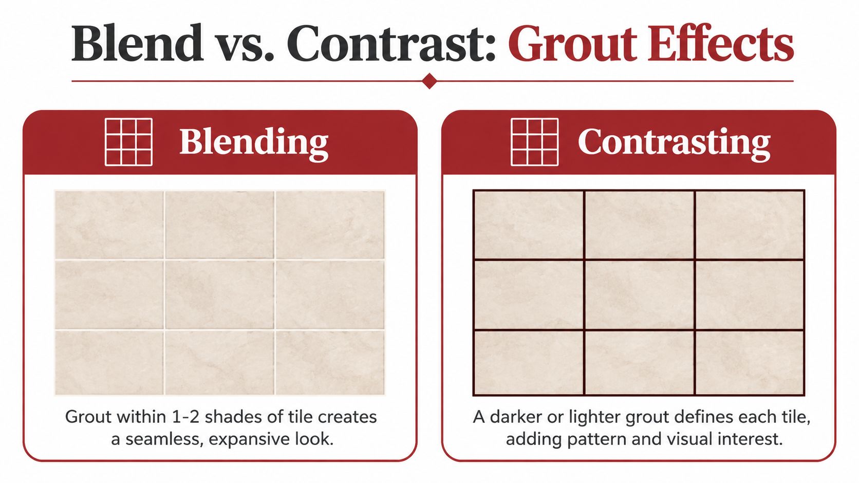
That visibility comes with a cost. Contrast reveals crooked cuts, inconsistent joint widths, lippage, and uneven transitions that a blended grout would soften. If the layout is intricate, the tile edges vary, or the substrate needs extra preparation, a strong contrast demands cleaner installation work.
Brightness matters too. Light grout reflects more ambient light, which can help a darker room feel more open. Dark grout absorbs more light visually, adding weight and definition. In a bright kitchen with pale cabinets, charcoal joints may provide useful structure. In a small bathroom with limited daylight, a lighter or mid-tone blend may protect the sense of openness.
Choose contrast because you want to see the pattern, not because the sample looks dramatic in isolation. Choose blend when continuity, forgiveness, and a quieter room matter more than graphic definition.
Tile Type, Joint Width, and Grout Chemistry
Color is only one part of the specification. The tile surface and joint width determine which grout can be used safely, and that choice affects texture, pigment behavior, and color availability.
For cementitious grout, the key dividing point is 1/8 inch. The Tile Council of North America guidance summarized for sanded and unsanded grout states that joints smaller than 1/8 inch should generally use unsanded grout, while joints of 1/8 inch and larger should generally use sanded grout. Always confirm the product manufacturer's instructions, especially with delicate finishes.
Unsanded grout has a smoother body and suits tight joints where sand could scratch a vulnerable surface. That commonly includes glass, polished porcelain, and rectified tile with narrow joints. Sanded grout adds body and stability in wider joints, making it appropriate for many rustic ceramics, tumbled edges, and natural-stone installations.
Using the wrong formulation can create practical defects, not just a different appearance:
- Too much shrinkage: An unsuitable product can pull away as it dries.
- Cracking: A grout that lacks the right body for the joint may not hold up.
- Pinholes: Poor packing or an incompatible mix can leave small voids that interrupt color.
- Uneven pigment: Porous or textured tile can draw moisture and pigment differently across the joint.
Textured and porous tile surfaces deserve special caution. They can absorb cement residue or pigment at the edges, making a light grout appear darker around the tile perimeter. A glazed surface behaves differently, reflecting more light and usually making the joint color easier to read consistently.
Chemistry changes the decision as well. Cementitious grouts generally offer the broadest color selection, but the final shade can vary with water ratio, mixing technique, curing conditions, tile porosity, installation method, and product batch. Epoxy grouts typically provide strong color consistency and stain resistance, but their available palette may be narrower and their installation requires careful packing and cleanup.
| Grout Type | Recommended Joint Width | Color Range | Best For |
|---|---|---|---|
| Unsanded cementitious | Generally below 1/8 inch | Broad, subject to mixing and curing variation | Tight joints, delicate or polished surfaces |
| Sanded cementitious | Generally 1/8 inch and larger | Broad, often suitable for deeper neutrals | Wider joints, floors, rustic or textured tile |
| Epoxy | Follow the product specification | Often more limited than cementitious grout | Projects prioritizing stain resistance and color consistency |
A sample is only meaningful when it uses the same grout type, the same tile, and a representative joint width. A beautiful color on a paper chart can fail once the actual surface changes how the pigment settles.
Testing Grout Color in Your Real Lighting
Don't approve grout from a paper swatch. Build a small sample that behaves like the finished installation, then inspect it where the tile will live.
Build a representative test
Start by ordering sanded grout samples in your shortlisted colors, even if the final project may use a different formulation. Mix small batches with water according to the product instructions, and don't casually add extra water to make spreading easier. Water ratio affects the cured appearance.
Trowel each test into a spare tile or scrap cement board. Use a joint width that resembles the planned installation, then allow the sample to cure fully. A practical test window is 24 to 48 hours, but the product instructions control the final timing.

Don't judge wet grout. Wet joints can look substantially darker or richer than the cured material, and a premature decision often leads homeowners toward a color that later appears too pale.
Check three lighting conditions
Tape the cured samples to the actual wall or place them on the actual floor. If you're testing a backsplash, position the board near the main sightline rather than leaving it flat on a workbench. For a shower, inspect it against the selected tile and nearby fixture finishes.
Check the samples under:
- Midday sun, when direct natural light may brighten and cool the surface.
- Overcast daylight, which is especially relevant in Southwest Michigan.
- Evening artificial lighting, with the installed bulbs or their intended color temperature. Warm bulbs around 2700K can deepen beige and taupe, while cooler bulbs around 4000K can make some grays read bluer.
Photograph each condition, but use the photographs as a record rather than a substitute for being in the room. Stand back 6 to 8 feet. Grout viewed inches from the joint can seem much stronger than it does across the full wall or floor.
Track the lot
Write the lot number from every grout bag on the back of the sample. If multiple lots are needed, dry-blend them before installation when the manufacturer permits it. Batch differences can make a finished field drift lighter or darker than the approved sample, even when the color name is identical.
Practical check: Approve the cured sample at the distance, time of day, and light source that matter most in daily life.
Matching Grout Color to How the Room Is Used
A grout color should suit the messes the room produces. A bright white joint can look excellent in a staged photograph, but kitchens, showers, basements, and entries each expose different weaknesses.
Kitchens reward forgiveness
White and ivory grout reflect light and keep a backsplash feeling fresh, but they also show oil mist, tomato sauce, coffee, and fine cooking residue quickly. Charcoal or brown grout hides many splatters more effectively, especially around a range, yet dark floor grout can make pale dust, crumbs, and pet hair more visible.
Mid-tone gray, taupe, or beige often provides the most balanced kitchen result. It won't disappear the way a close light blend can, and it won't outline every tile as aggressively as black. On a busy backsplash, that middle position usually makes routine cleaning less visually urgent.
Bathrooms expose water and product residue
A light shower grout shows shampoo dye, toothpaste, soap film, and hard-water deposits. Dark grout hides some pale residue but can reveal mineral streaks and iron staining. In Southwest Michigan homes supplied by well water, iron-tinged drips can leave rusty-looking marks, particularly in showers or around fixtures.
Curbless showers need the same practical thinking as standard showers, with added attention to standing water, splash paths, and transitions. A mid-tone grout can protect brightness without making every drip the focal point.
Basements need a moisture-aware choice
The lightest white grout can show yellowing or discoloration when basement conditions involve humidity or moisture migration. A mid-tone neutral is usually less visually vulnerable, but color alone doesn't solve vapor or drainage problems. The installation needs appropriate waterproofing, substrate preparation, and product selection.
For basement tile, look for a grout product with built-in mildew inhibitors where the manufacturer offers that formulation. Don't use grout color to conceal an unresolved moisture issue.
| Room / Use | Light Grout, white or ivory | Mid-Tone, gray, taupe, beige | Dark Grout, charcoal, brown, black |
|---|---|---|---|
| Kitchen backsplash | Bright, but exposes sauce and grease | Balanced visibility and upkeep | Hides many splatters, shows pale dust |
| Kitchen floor | Shows crumbs and traffic quickly | Forgives ordinary debris | Can reveal lint, pet hair, and mineral residue |
| Bathroom wall | Makes the room feel bright | Reduces the drama of water marks | Defines tile, but exposes light deposits |
| Curbless shower | Shows soap and mineral residue | Practical compromise for daily use | Can reveal iron streaks and pale buildup |
| Basement floor | Vulnerable to visible moisture-related discoloration | More forgiving in changing conditions | Hides some dirt, may darken the room |
| Powder room or entryway | Crisp and decorative | Flexible and easy to coordinate | Strong design line, often worth the upkeep |
A bolder color makes sense in a powder room or entry where the tile pattern is meant to be noticed. In a family kitchen or frequently used shower, the grout should support the cleaning routine rather than fight it.
Sealing, Cleaning, and Long-Term Upkeep
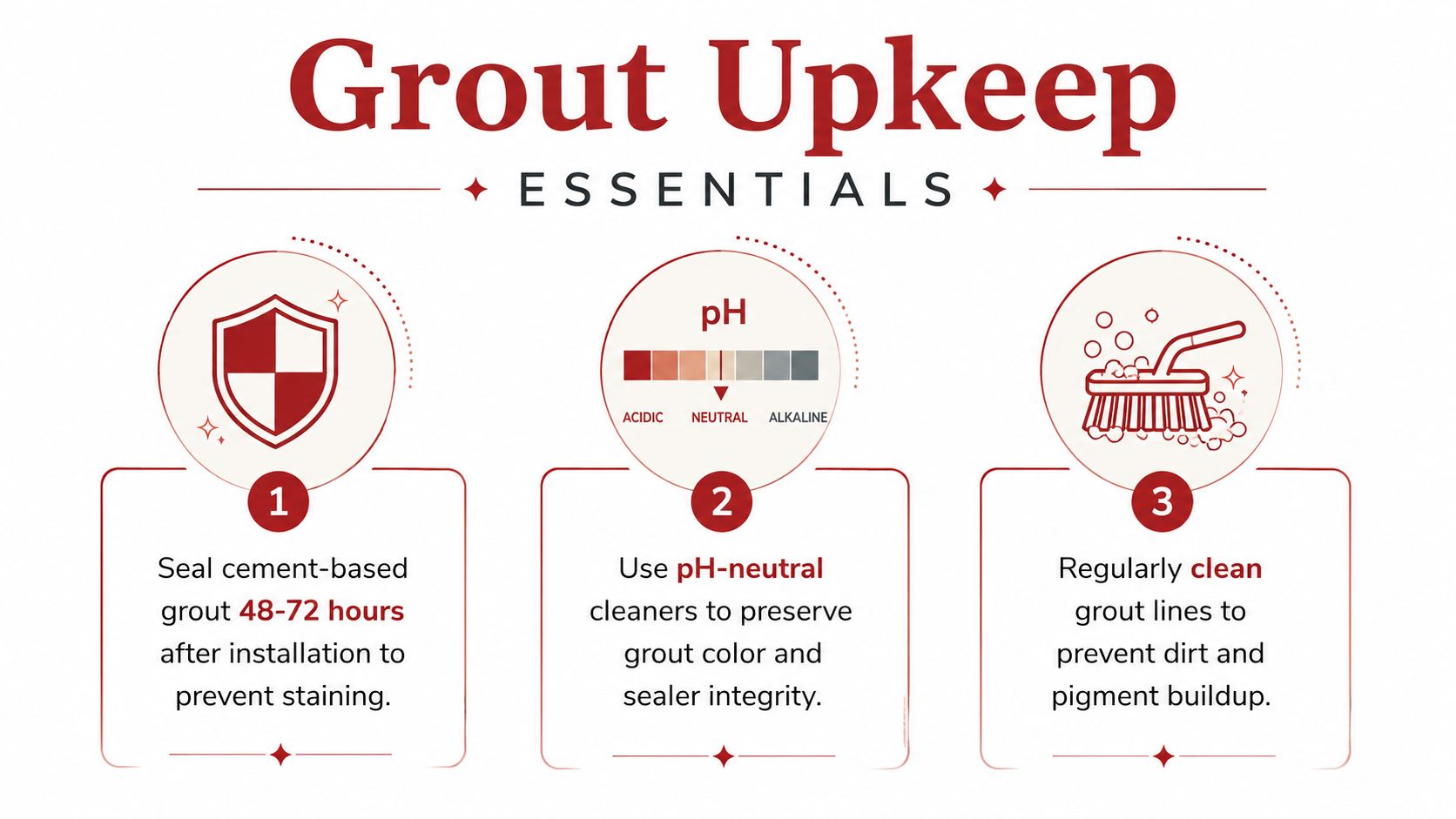
Cement-based grout, whether sanded or unsanded, is porous. Plan to seal it 48 to 72 hours after the final cure, following the grout and sealer manufacturer's directions. A penetrating sealer helps reduce staining, but it doesn't make the joint maintenance-free.
Darker pigment often conceals the slight sheen or application variation of a penetrating sealer more easily than bright white. White grout can look patchy when the first coat is applied unevenly, especially across a large floor. Apply consistently, remove residue from the tile face, and don't assume more sealer is automatically better.
Epoxy and urethane grouts are generally stain-resistant and rarely need sealing, though their color selections can be more limited. They also need to be packed fully during the first pass, because correcting an incomplete joint later can leave a visible transition.
Match cleaning to the grout
Light grout reveals soap scum and hard-water deposits quickly. Use a pH-neutral cleaner rather than vinegar or bleach, which can damage pigment or affect the grout and sealer over time. Soft brushing on a consistent schedule is safer than waiting until buildup requires aggressive scrubbing.
Dark kitchen grout can absorb oils at cooking and walking paths, and the color may lighten in those areas. A color-refreshing sealer may be appropriate every 2 to 3 years, depending on product instructions and actual wear.
Keep the original grout bag, color name, and lot card. Future repairs are much easier when the installer can match the original product instead of relying on a memory of the color.
Southwest Michigan Inspiration and Next Steps
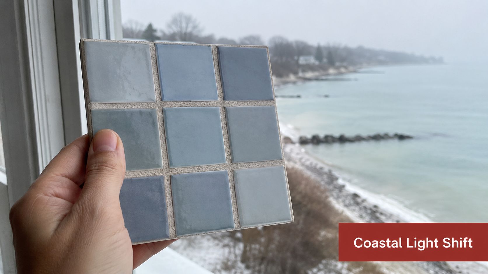
Southwest Michigan light changes the decision throughout the day and across the seasons. Coastal humidity near Saugatuck can make a room feel softer, gray winter light in Kalamazoo suburbs can push cool colors forward, and long summer days along Lake Michigan shorelines can make pale grout look much brighter than expected.
That's why mid-tone neutrals often deserve a serious test. Greige, warm gray, taupe, and muted beige can accommodate four-season shifts and lake-effect overcast without making a small room feel either stark or heavy. Bold charcoal, deep green, navy, or terracotta can still work, but only after a cured sample has been checked beside the actual tile, fixtures, cabinetry, and paint.
Pull free color samples, schedule a walkthrough, and compare sanded versus unsanded options in a real estimate. For early budgeting, use the instant pricing tool to compare project costs before finalizing the tile and grout specification. Trademaster Construction can coordinate tile procurement, layout drawings, mock-ups, and sealed installations for kitchens, bathrooms, basements, and curbless showers across Southwest Michigan.
Trademaster Construction can help you test grout against your actual tile, lighting, and room conditions before installation, then carry the choice through layout, sealing, and finishing. Visit Trademaster Construction to review remodeling options and start planning a Southwest Michigan tile project with a practical budget in mind.